 |
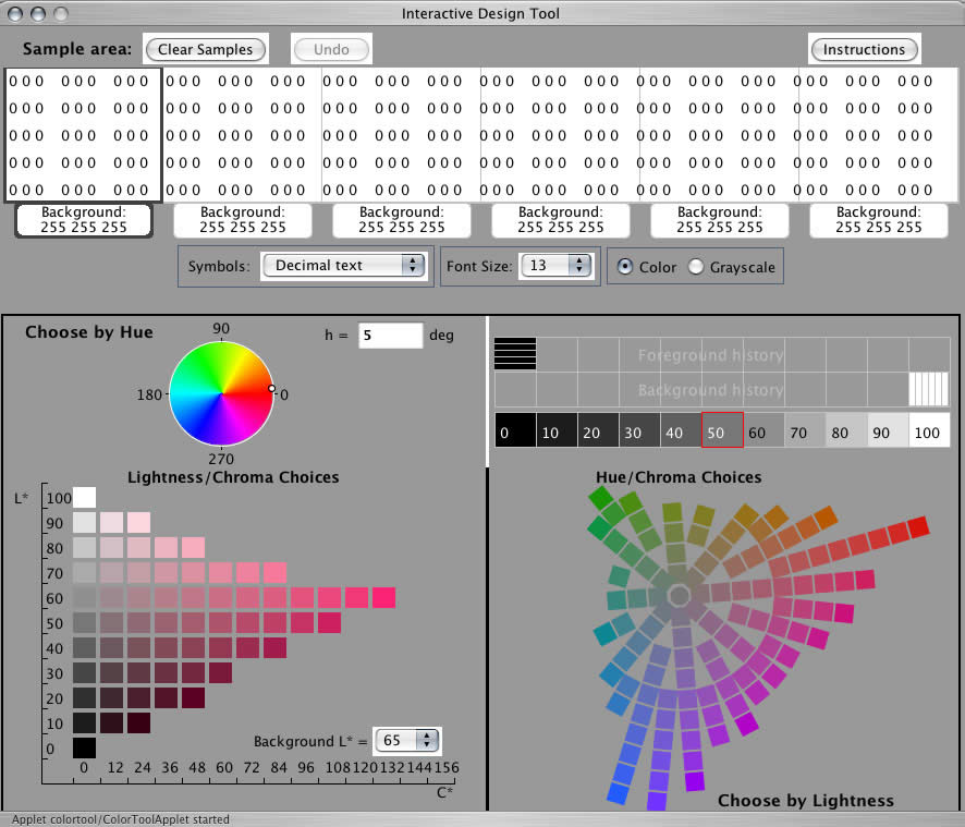
| COLOR TOOL EXAMPLE: DISPLAY PROTOTYPING Lets use the Color Tool to design a color scheme for a cockpit moving map display, presenting navigation information, convective-weather hazards and both hazardous and non-hazardous terrain. Well assume that weve already figured out all the data classes we want to represent and prioritized them according to their urgency. Our first task is to choose a contrast polarity. Well use dark symbols on light backgrounds. For this polarity we want to choose the lightest background colors possible, to give us maximum latitude for choosing dark and medium colors for symbols. In our salience hierarchy we will want to draw maximum attention to hazard information and least attention to context information (map details, non-hazardous terrain, etc.). Well use grays for most of the low-priority information. Now were ready to start a first draft of color choices. Lets choose colors for the backgrounds. Lets say we need colors for 5 levels of terrain and 4 levels of convective weather (clear, light, caution, and warning). The weather colors will be constrained by cultural conventions for safety coding. We will use red for warning, amber for caution, green for non-hazardous light precipitation, and white for no weather). For non-hazardous terrain theres no compelling reason to code with hue, so shades of gray will be used, with white representing the lowest elevations and darker grays for the highest. On launch the Color Tool presents the default colors, i.e., white backgrounds and black symbols:
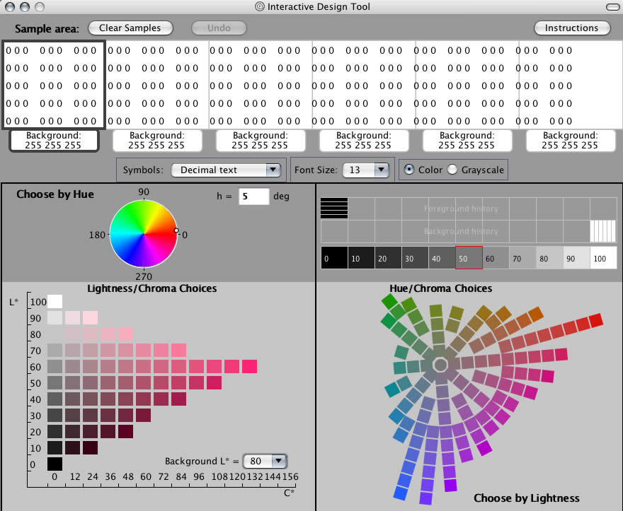
First lets set the background of the Choose by... panels to a gray that approximates what our backgrounds will be, say L* = 80:
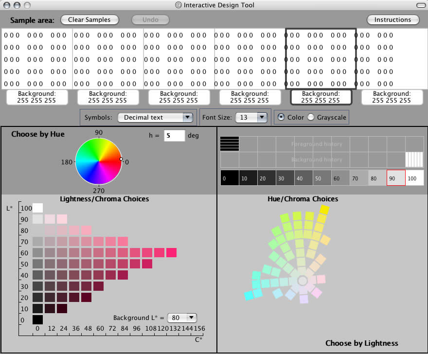
This will help make the appearance of the color samples in the panels what it will be in the graphic. We want to keep our backgrounds as light as possible. Lets leave the rightmost background white, to represent the no weather backgrounds. Next we click on the tab of the background next to it and try to find a suitable green for the weather. Lets look at the possibilities at each background lightness. Theres only white at L*=100, so lets look at L*=90 (click on 90 in the Choose by Lightness panel):
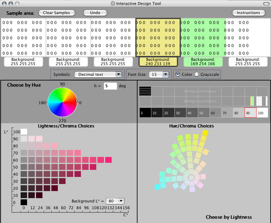
There are a couple of decent greens here and some yellows and ambers that might work for weather amber, but well have to look further for a red. Lets choose a green for this background and a yellow for the next:
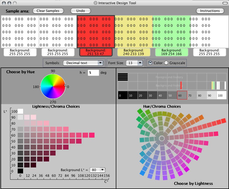
[If both the green and yellow are chosen from L* = 90 we may later find that the border between them is indistinct due to the low luminance contrast between them. In that case we will either place a thin border line around the yellow or choose a slightly darker green.] Now lets look for the weather red. It has to be a warning, so it needs to be saturated and salient. Theres nothing at L*=90. Nor is there anything sufficiently saturated at 80 or 70. We have to go all the way to L*=60 to get a vivid red:
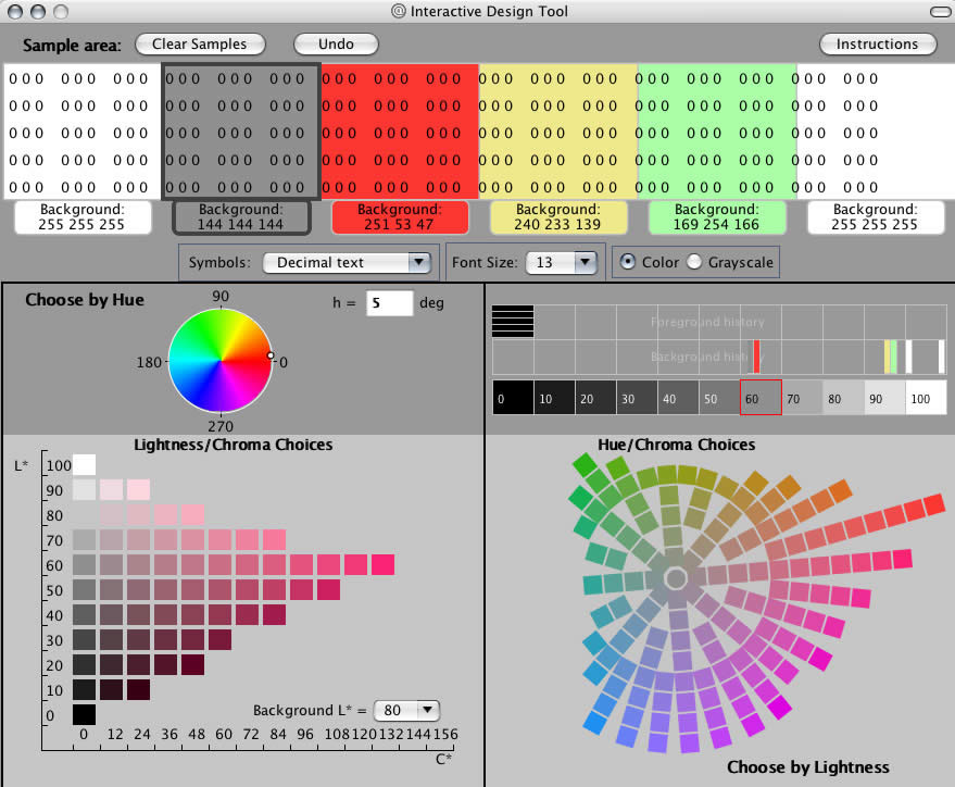
We only have two background panels left in the Color Tool, so well have to do a separate Color Tool session to choose background colors for terrain. For now, lets just see if the symbol colors that work on the weather colors will work on the darkest gray that we are likely to choose for the terrain. (Recall that were going to choose dark colors for symbols, so if theyre legible against the darkest background colors were okay.) Lets assume that we will use L* = 60, 70, 80, 90, and 100 for the five terrain levels. Then L*=60 is our darkest terrain, so we want to see if symbols that work on the weather backgrounds also work on this gray (you select this gray either by clicking on the middle patch of the Choose by Lightness panel or by clicking the L*=60, C*=0 patch in the Lightness/Chroma panel) :
With our first set of background colors chosen were ready to look for symbol colors. First, notice that black text is clearly legible and has reasonable salience against all of our backgrounds. so we only need to worry about data with higher priority than the data that we assign black symbols. xxx. with the highest priority data, e.g., aircraft in some emergency state, requiring immediate controller action. We want a red that has reasonable luminance contrast (L* difference) against all the backgrounds. We select the top line of text and look at dark colors using the Choose by Lightness panel. |
|
Related Topics:
|
