 |
| Design Process | Color Graphics Topics | Color Tool | Color Guidelines |
Aerospace |
Color Science | Utilities | Site Map |
LUMINANCE CONTRAST IN COLOR GRAPHICS
This page describes the range of colors produced by a display in terms of their visual appearance. It also offers
advice and tools to help non-color-scientists
find color combinations that have the desired luminance contrast. Controlling
luminance contrast is much more difficult in color graphics than in achromatic.
There are complicated constraints among hue, saturation, and luminance
on real display devices that can be difficult to keep clearly in mind. Let's assume that
you have already decided what you want the luminance contrasts between
the symbols and backgrounds in your display to be. It's straightforward
to achieve those contrasts in grayscale, but how do we do it in color? Our freedom to choose
colors at particular desired luminances is limited by two kinds of constraints:
|
|||||||||
The
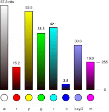
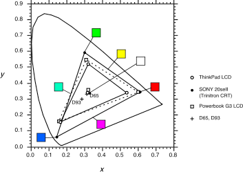
Physical Color Gamuts of Displays The color gamut of a display is simply the entire range of colors that it is capable of displaying. 2D Color Gamut. One often finds the color gamut of a display plotted in 2D coordinates. This CIE x,y plot shows the 2D gamuts of a CRT monitor and two laptop LCDs. The color patches show the CRT colors at their maximum luminances (which aren't equal).While these are the correct chromaticity coordinates for the displays' colors, this method of plotting can be very misleading--these colors are not all available at the same luminance. Saturated blues and reds are much less luminous than greens and yellows. |
|||||||||

|
|||||||||
|
|||||||||
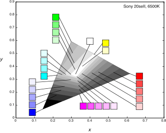
This illustrates a second property of the 3D gamut: the higher luminances are only available at low purities (and therefore low visual saturations). |
|||||||||
|
Why are the luminances
of the primaries different?. The primaries have been given these luminances
by design, to achieve white alignment of the monitor. This is one of the
requirements for portable graphics files to display properly on any display.
Early designers of computer displays decided that equal R, G, and B digital
codes should produce a particular neutral chromaticity, the "alignment
white" of the monitor (usually 6500K or 5300K). Once the white alignment
color is decided and the chromaticities of the three primaries are chosen
the maximum luminances of the primaries must be set to the values shown
above. This is simply because these are the luminances of the primaries
that will mix to give the alignment white. The
Effect of Luminance on Saturation The second major constraint
that affects our freedom to choose colors at particular desired luminances
is the visual loss of saturation at low luminances. The 3D gamut above
captures the loss of saturation at high luminances--the colors converge
on white. Over a range of low luminances, though, the gamut is the full
triangle between the chromaticities of the primaries. Over this range
the monitor is physically able to produce its maximum range of chromaticities
as the luminance decreases toward zero, but to the human visual system
the lights all become barely distinguishable from black. This visual effect
is illustrated by the dark colored squares at low luminances in the 3D
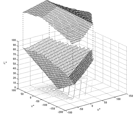
gamut figure. We can represent this visual phenomenon graphically by plotting the gamut in a different standard coordinate system, the CIE L*u*v* coordinates. |
|||||||||
|
|
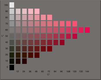
This is a plot of the 3D gamut of the same CRT monitor in CIE L*u*v* coordinates. This transformation was developed as an approximation of a visually uniform space. As in the xyY plot above, the blue primary is in front, red is at the back right, green is at the left, and white and black are at the top and bottom, respectively. Here, however, the colors converge on black as the brightness variable, L*, goes down, modeling the loss of saturation of pure lights as the luminance decreases. The panel below shows the colors in a vertical slice from the origin toward the red corner of this color solid.
|
||||||||
|
The
Implications for Color Design: Selecting Colors with the Right
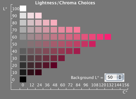
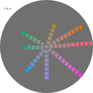
Luminances The difficulty of selecting colors with the right luminances is now plain: Suppose that you can only get enough luminance contrast on your bright backgrounds if your symbol color has an L* of 20 or less. You will be unable to get a bright red warning color. To get an adequately saturated warning color you must set up your background luminances such that symbols of L* = 50 to 70 will have enough luminance contrast with the background to be clearly legible. To make the color design problem even more complicated, the highly saturated colors are at different L* for other hues. These constraints on the colors in the display gamut make selection of symbol and background colors with particular desired luminances more complicated than in a grayscale design. We need to choose colors such that the symbol colors will have sufficient contrast on all of the possible background colors. At the same time, the symbol colors must be discriminable and possibly identifiable. These various constraints can sometimes be very difficult to satisfy. Color selection would be somewhat easier if we could interactively view the display's gamut and select our colors in L*u*v* space. We offer a tool on this website that lets you select colors from L*u*v* and preview your selected symbol and background combinations. It has two selection panels that are different cross-sections of the above L*u*v* gamut: |
|||||||||
|
|||||||||
Related Topics:
| |||||||||
