Designing Apple.com's First Mobile-Optimized Web Platform
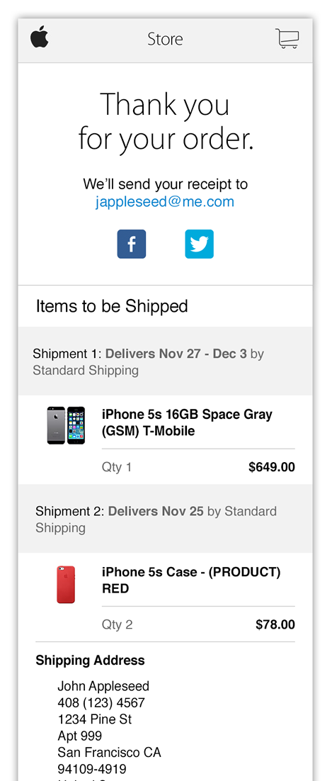
The central business ask for this project was to design a mobile-optimized version of apple.com's Cart/Checkout/Thank You Page flow. Behind that initial requirement was the larger task of defining our entire mobile-optimized design system. My team led the conversation and provided answers for most of the key questions; responsive web vs. a device-focused implementation? How is the grid system defined? What styles meet brand, functional, and accessibility needs? How do the styles match up with the non-mobile experience?
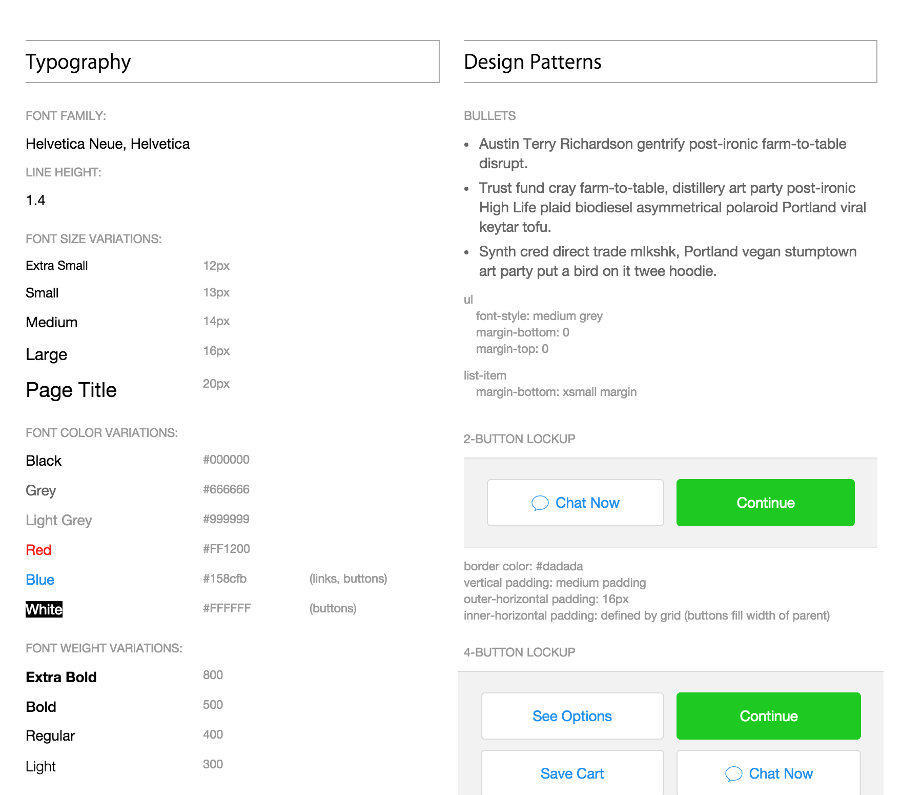
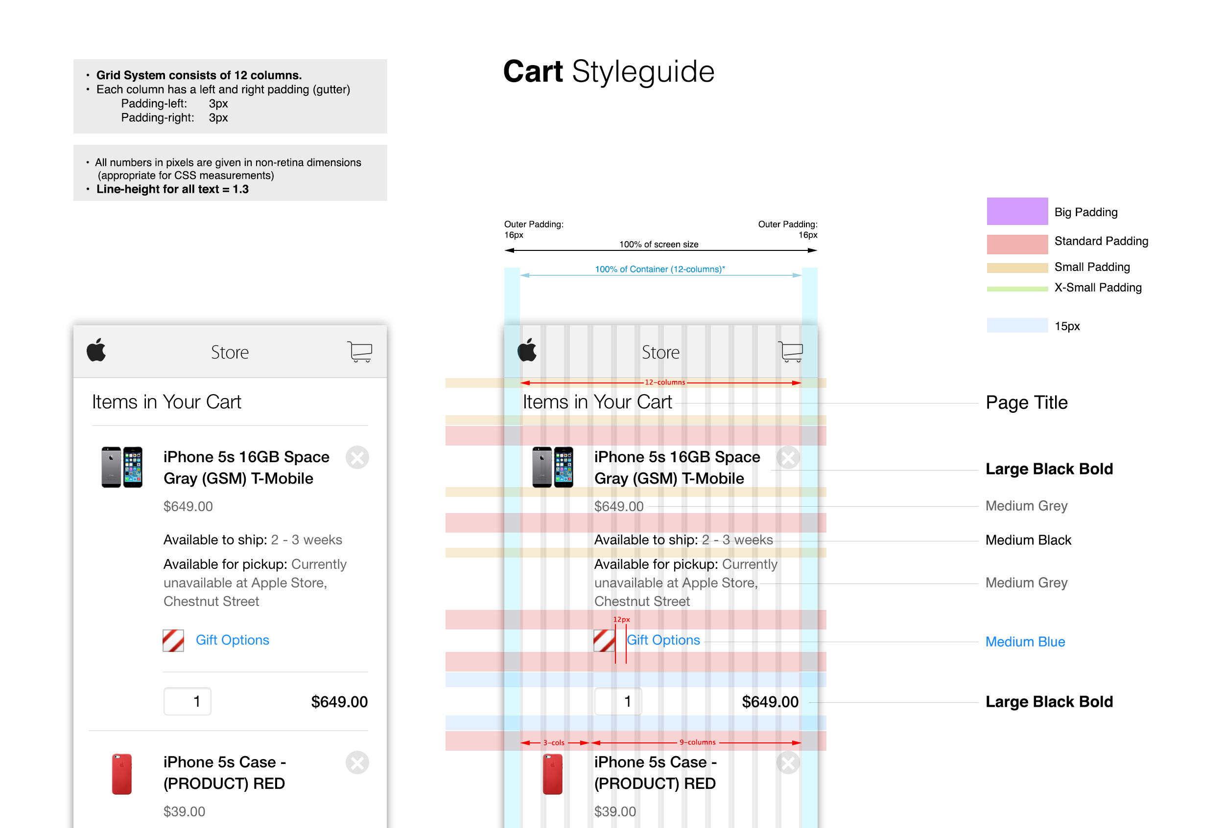
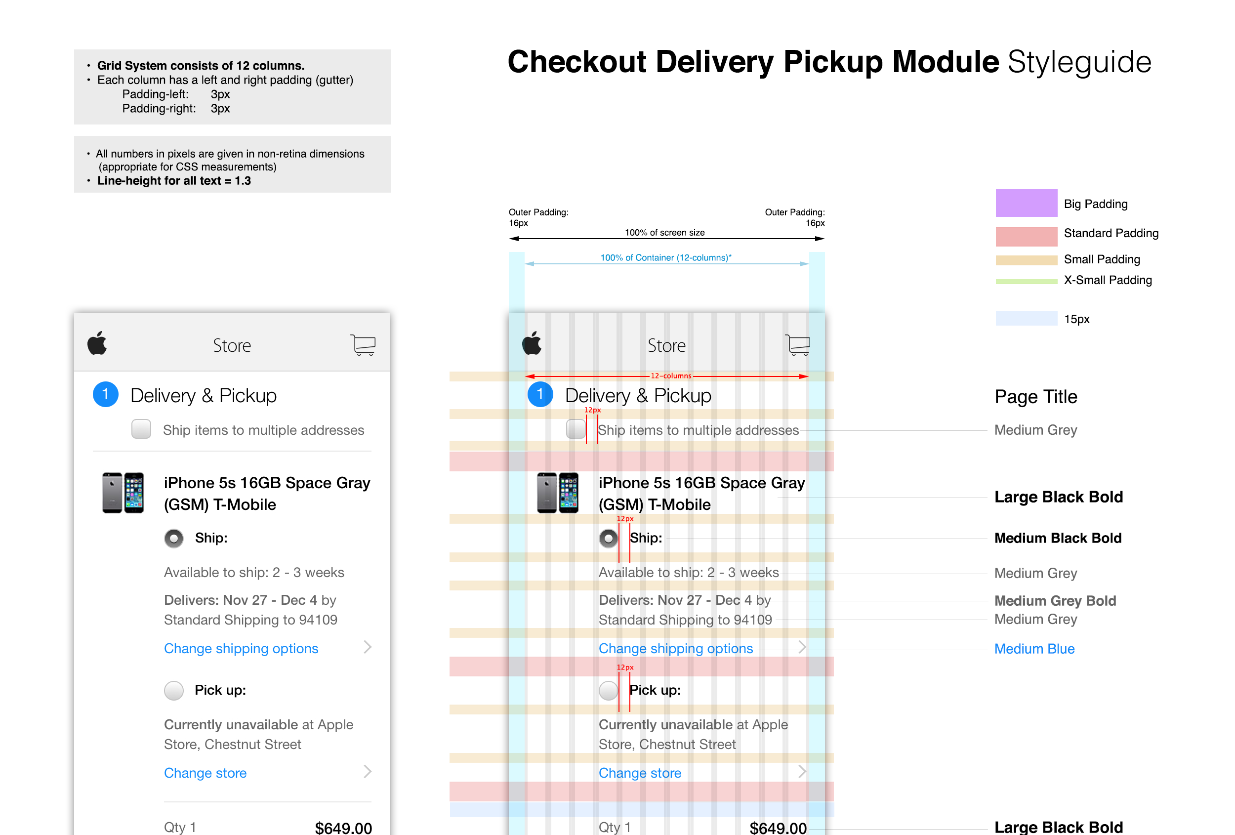
For the project, we created the Online Store's first HTML-based style guide. In it, we defined the usual elements of a style guide, plus UI elements, interactive design patterns, and animation specifications.
In the end, my team designed the first web-based mobile platform for apple.com. The designs have endured and have now been proliferated to many countries around the world.