Minimum
Luminance Contrast for Legibility
Current
guidelines for luminance contrast of graphic elements are directed at
assuring sufficient luminance contrast for legibility.
Examples:
8.6.2.6.2
Text-background contrast. The contrast between text and its background shall be sufficiently
high to ensure readability of the
text.
8.6.2.6.3
Color foreground/background difference. In general, the color foreground
shall differ from its background by a minimum of 100 delta-E (CIE Yuv)
distances.
8.6.2.6.4 Contrast. An adequate
contrast of at least 7:1 should be maintained between foreground and
background
colors to enhance color perception and perceived image resolution.
FAA Human Factors
Design Standard http://hf.tc.faa.gov/hfds/
This is certainly
an important consideration, and such guidelines should be continued and
improved. For this purpose the main improvements that are needed are
better community agreement on
1) the appropriate statistic(s) for luminance contrast for various graphics
and viewing conditions, and
2) the required levels.
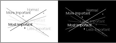
Multiple Levels
of Luminance Contrast--Managing Attention
Symbols
and text that convey high-priority information should have high luminance
contrasts. However, if too many graphic elements have high luminance contrast
it becomes difficult for the user to locate the most urgent data--the
display becomes cluttered.
One solution is to
remove some of the information, placing it on another display or another
page that can be displayed. This solves the problem of clutter within
each page, but it introduces another set of difficult problems relating
to the user's management of the several displays/pages and integration
of information from several pages in the user's mind.
Another approach that
is often useful is to leave less urgent information on the same display,
but to give it less graphic emphasis relative to the most critical information.
One way to reduce graphic emphasis is to assign less luminance contrast
to less critical information.
To use this kind of
design we need to choose safe, usable luminance contrasts for each level
of urgency. We know of no current guidelines that address appropriate
luminance contrasts.
We're working to develop
guidance about 1) how many levels of urgency can be effectively distinguished
using luminance contrast, 2) what the relative luminance contrasts should
be, and 3) what the minimum luminance contrast of the least urgent level
should be.
|